Vermontville Maple Syrup Festival Rebrand Project
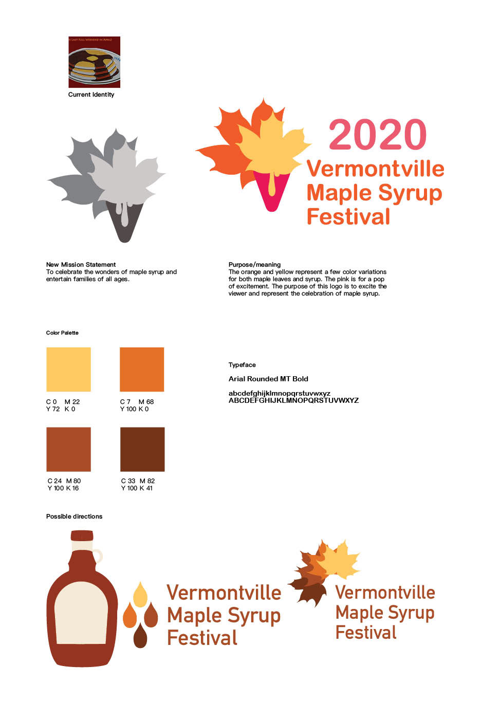
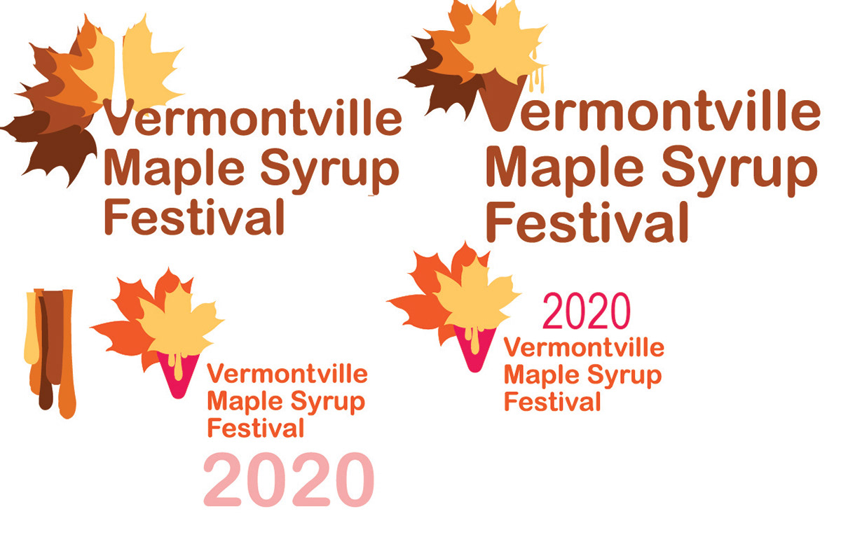
The Vermontville Maple Syrup Festival is one of Michigan's oldest maple syrup festivals and attracts a large crowd. My goal was to have the logo have a fun and family-friendly vibe to it. The orange and yellow represent fall and the pinks give the logo the energetic twist I needed. I chose rounded san serif fonts to support the family-oriented feel.

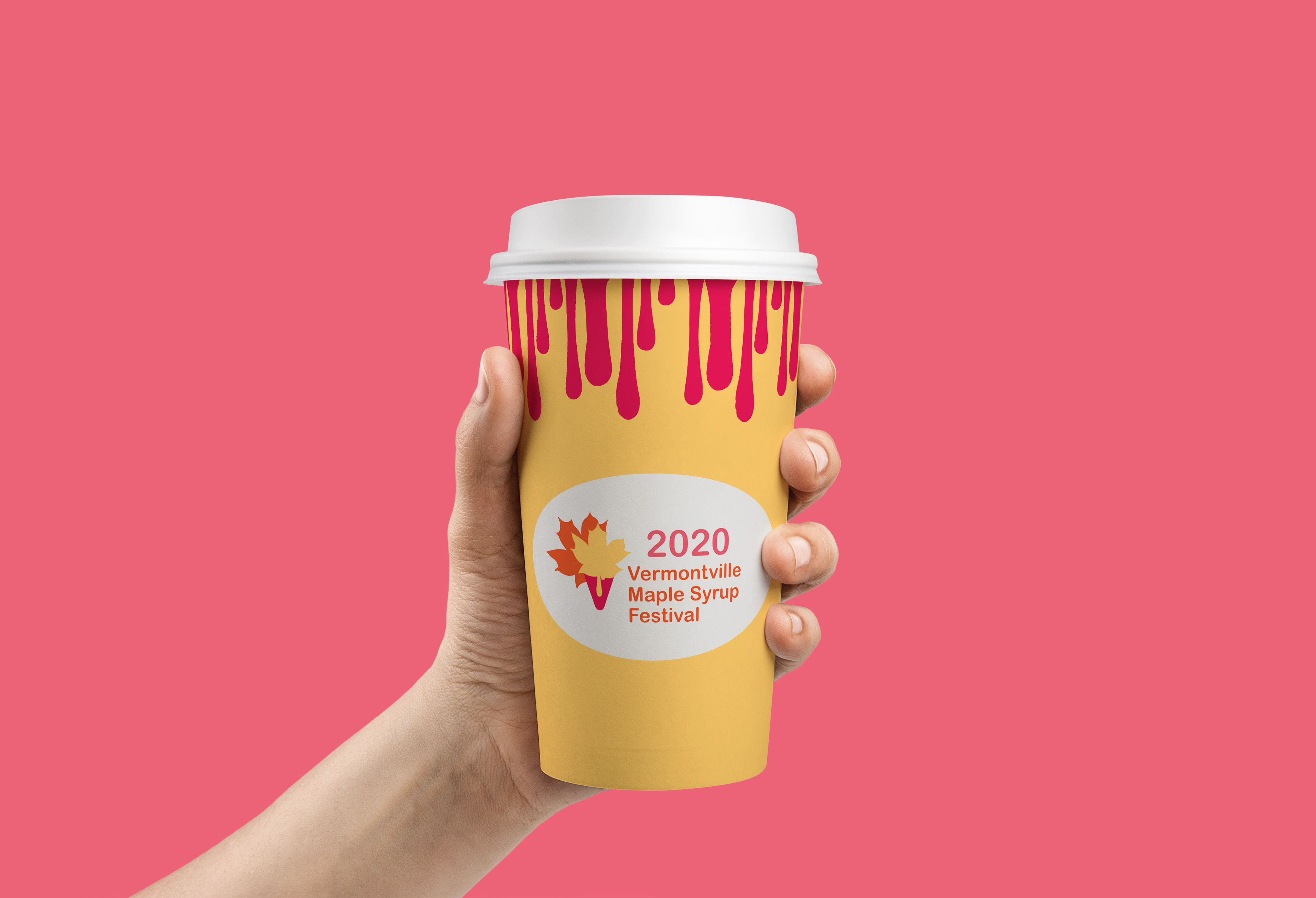
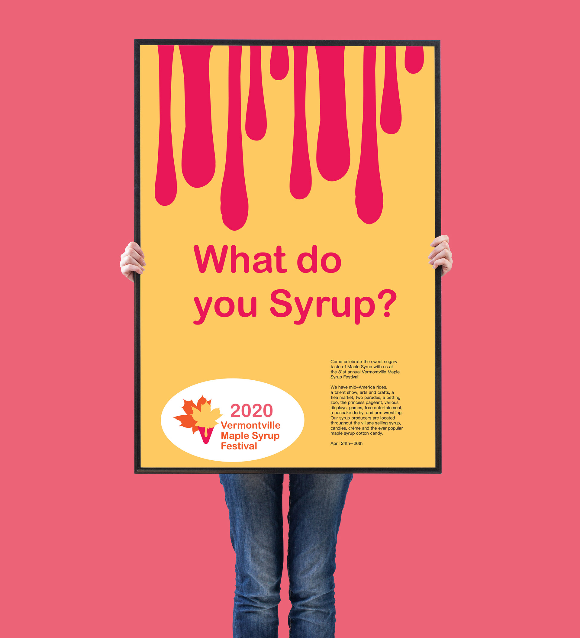
I wanted the festival workers to stand out from the crowd. I used the yellow t-shirts to support that theme. I also kept the cup yellow and then added the maple syrup drips for movement. I wanted the poster to draw attention so I used the same color and movement process.
